Wednesday, 11 January 2017

Part 1B - Worcester (Week 11 & Week 12 : Independent Drawing Assignments)

11/01/17

I spent the day in Worcester completing the second half of Drawing Reporter Part One. I walked around the city drawing parts that I thought contrasted with the drawings I did in Banbury, but maintaining the same style and colour, as the brief requested.

I found this task difficult to enjoy due to the weather. It was fairly windy and cold during the day and it made it difficult to draw. My favourite pieces are the inside of Worcester Cathedral, (4), and my evening drawing of The Sabrina Bridge, (8).

I really like (1). I found it difficult and would have liked to spend more time on it, but it was getting quite windy and my paper was flipping up as I drew. I feel like I chose a good medium to get across the dimensions and the detail but maybe could have gone with a more detailed approach to suit the building I was drawing. It is part of the city so thematically, it goes well with the task.

I am not a fan of (2). When I began with that medium and started my timer, I immediately made the decision to make it one of the pieces I spent less time on. In hindsight, I should have started again with a different medium and taken my time as I was inside and not affected by the weather.

(3) was an interesting one. Usually, I don't like working with pastels. I find it hard to create detail and rarely like the results I get after use but I feel it works well here. Using just the black and white made me focus more than I usually would with oil pastels. Although it is not my favourite piece, it was a lesson in using mediums you might not like, just in case a different subject is needed to bring it out.

A similar lesson was learnt with (4). I went inside The Worcester Cathedral to draw and chose to use charcoal. Usually, I really don't like charcoal. This is because it is messy and smudgy and I prefer something more controlled. However, I used my charcoal pencil carefully and really took my time in a quiet, inside environment and I really enjoyed it. The members of staff there were encouraging and happy for me to draw even through their daily service, I will definitely be going back to do more drawing.

Afterwards, for (5), I decided to draw the scaffolding on the outside of the cathedral. This is because I think it represents the theme of the big city against small city well, with regards to development and scale. I don't like this drawing very much. I found it difficult to get depth and lost confidence almost immediately when I began to draw, which I think made me not draw very well.

(6) was more successful. I feel like I exercised angles and proportions well here by trying to focus on the windows and where they were. I was also pleased with the composition I'd made with the scaffolding, it brings something to the piece as a whole.

I thought it would be good to include the apartments at city campus, (7), because I was close by and because they look very modern. It works well as a contrast to the older buildings in Banbury.

(8) is definitely my favourite piece. I love drawing the light on dark paper and using negative space to create a good drawing. There's so much more life in this drawing compared to the other pieces. This may be to do with enjoying it more.

I drew (9) because it is a hill I go down almost every day to walk to lectures. It is good in comparison to my drawing of the road near my house in Part 1A in that you can see the city skyline partly. Because of my position drawing, I chose to make it a quick draw, but unfortunately this left the quality lacking and so I feel the piece isn't great.

(10) was another piece where I regretted the medium I chose. In future I may plan my route and my locations better, choosing mediums before I go. This way I can avoid disliking pictures as much after I have painted/ drawn them.

In conclusion, this was a valuable and task where I learnt a lot but I did not enjoy it as much as previous tasks we've had. I enjoy drawing people and nature and so I can easily get into the flow of it. However, when drawing architecture I was hesitant in the sense that it was just less fun. What I did find interesting was that to contrast two places, you don't necessarily have to pick two places all that different from each other - just cherry pick what you draw. For instance, Banbury is a town; It has a train station, large flats and a high street. Worcester is a city and it has old buildings and local cafes. If I wanted to, I could do a comparative drawing task between them.

It was also a shame I didn't use any wet media in these pieces, although this was purely down to it being windy and thus impractical.

(1)
The Hive, Worcester. 20 Min. Byro and Fine Liner.

(2)
View of Bridge From Cafe, The Hive, Worcester. 7 min. Felt-Tip Pen and Byro.

(3)
Train Station Bridge, Worcester. 10 Min. Oil Pastel. 

(4)
Cathedral View From Pew, Worcester Cathedral, Worcester. 33 Min. Charcoal.

Pictured Left - (5) Scaffolding Outside Cathedral, Worcester Cathedral, Worcester. 5 Min 51 Sec. Chalk.
Pictured Right - (6) City Campus Building, Worcester, Watercolour Pencil. 10 Min.

 
(7)
City Campus Apartments, Worcester. Byro. 5 Min.

(8)
Sabrina Bridge in the Dark, Worcester. Watercolour Pencil. 10 Min.
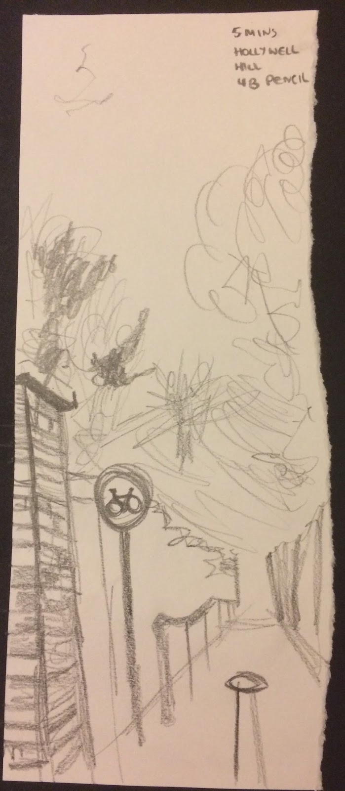
(9)
Hollywell Hill, Worcester. 4B Pencil. 5 Min.

(10)
Gate Opposite Costa, Worcester Town Centre. Assorted Fine-Liners. 5 Min.


Friday, 6 January 2017

Part 1A - Banbury/ Brackley (Week 11 & Week 12 : Independent Drawing Assignments)

06/01/17

I spent the day in Banbury (one drawing completed in Brackley on my way back) completing the first half of Drawing Reporter Part One. I chose to do this in two parts because I wanted to compare my hometown against Worcester - small-town against city-scape. 

I explored parts of it that I saw as specific to a small-town and that I saw as archetypal to Banbury. I started with the canal, (1), and really enjoyed using chalk as a medium. I haven't used it in a long time and it took me a moment to get the hang of it. After fifteen minutes it started to rain and as I had no shelter I had to leave the piece as it was. I feel like this drawing did not reach it's potential, though I am proud of it and received a compliment from a passer-by.

Next, I drew the bus station (2). I don't like this drawing, I can't pinpoint why but I think maybe I should have used different mediums e.g. oil pastel for the background. That may have made the piece more interesting.

I did (3) on a small piece of black paper I ripped and stuck in my book. I drew the closed down pasty shop with watercolour but it didn't come off well on the paper, so I added acrylic and it worked more. Although the image lacks detail, I like it and feel like the message of the drawing comes across; broken.

(4) went terribly. I bought a Tipex pen to experiment and thought it would be like painting acrylic with a pen. Unfortunately, I found it terribly difficult to use and so only did a five-minute drawing. I don't regret it because it's always good to experiment. 

I'm fond of (5), it looks delicate and pretty which is how I see the gazebo in town. 

I am not a fan of (6). I don't enjoy using oil pastels but in wanting to use a range of mediums I chose to bring them with me. It's not awful but it's not very clear. In hindsight I would have used oil pastels on a bigger piece, not a smaller one - then it would have been more detailed.

I drew (7) near my house when I walked home from the bus. The lights were bright against the dark sky and so I thought it would look great. I should not have stuck the black paper at an angle though because however nice, compositionally, it looks; it made perspective and angles confusing. This is not something I foresaw and so will learn from this in future e.g. doing the drawing then mounting it at an angle. 

(8) was drawn from the viewpoint I had at the back of the bus. Luckily there weren't any people, except for at the front of the bus, so I had a clear view to draw the architecture of the transport many people use to get from place to place where I live. I like it but I wish I'd spent longer on it, however, I did not start the drawing until well into my journey and I needed to prepare to get off the bus. 

(9) is my favourite drawing. It is the potato van outside my place of work. I enjoyed this as I incorporated the tree and I love drawing nature. I've done something with the angle that I didn't see until looking at the piece later, this is a lesson in really looking at what I'm drawing and also to possibly get an easel/ choosing my viewpoint better.

(10) is my second favourite. By using the felt tip and the byro I created depth. I also like the way I've mounted it (done previous to drawing). The combination of nature and architecture is pleasing, so is the perspective.

Overall I enjoyed this exercise, though not as much as I enjoyed e.g. the cafe drawings exercise where we drew people moving. I thought that the lack of people in my drawings would take away from them, but actually, they don't always need that. I enjoyed experimenting with only two colours (black and white) and using white on black paper. I need to work on really looking at what I'm drawing and assesing angles and viewpoints more, but apart from that I'm pleased with what I produced.,


(1)
The Canal, Banbury. 15 min. White Chalk on Black Card.

(2)
The Bus Station. Banbury. 20 min.White Watercolour Pencil. 

(3)
The Cornish Pasty & Tea Shop (Closed Down), Banbury.7 min. Watercolour/ Acrylic Paint.

(4)
Bench and Wall in Castle Quay Shopping Centre, Banbury. 5 min. Tipex Pen.

(5)
Town Centre Gazebo, Banbury. 5 min. Black/White Coloured Pencil.

(6)
Street by The Fleur Pub, Banbury. 10 min. Black/White Oil Pastel.

(7)
Street Lights, Brackley. 7 min. White Watercolour Pencil & Chalk.

(8)
500 Bus From Banbury to Brackley, Commute. 10 min. Black Byro.

(9)
Curly's Potato Van, Banbury. 20 min. Black Watercolour Pencil.

(10)
David's Flowers, Banbury. 10 min. Black Felt Tip Pen & Black Byro.

Sunday, 4 December 2016

Sketches of the Day: 28th - 04th

This is my second post dedicated to my daily sketches. It was harder to complete this week and I found myself using byro pen more often as I'd often forget until last minute and use what was in my backpack at the time. This is because it is the end of term and I'm quite busy, but I'm glad I made time for them. I've enjoyed it as it serves as a visual diary and is interesting to look at, at the end of the week.

28.11.16
Feet on Bed
Byro

This drawing was done on my bed before I went to sleep. I'd forgotten to do my daily sketch and I thought I'd try drawing myself. I'm pleased with the proportions but wish I'd added more tone. 

29.11.16
The Owl and the Sheep
Byro

This is a drawing of the stuffed animals I have on my bed. It ended up looking really creepy but I like it. I'm pleased with the texture of each individual toy and think it's a good piece.

30.11.16
The Bins
Byro

Here I've drawn the bins in my kitchen. I drew them because one had rubbish in and one didn't and I thought that would look interesting. I like the image as I've added an environment too so it's more together. To make it better I could use a thick fine-liner to add shadow.

01.12.16
Keys and Bear Memory Stick
Watercolour Pencil

Here I've drawn my lanyard, memory stick and keys as they are something I carry with me every day. I have forgotten to add shadow to the piece which lets it down, probably due to rushing it a bit as I did it in the evening. 

02.12.16
Watching a Walk in the Woods
Watercolour Pencil

Here I've drawn my laptop while I was watching a movie for my creative writing studies. It was showing lovely outdoor scenes so I thought it would be interesting to draw my laptop showing them. In hindsight to make in more interesting I would do the laptop, table and background all monochrome and then make the screen a vibrant green to symbolise the idea I was getting across - Irony of admiring nature from a computer screen.

03.12.16
Handbag on Floor
Blue Byro

I drew this as my handbag was overflowing and I thought the viewpoint was different to pieces I've done before. I like this piece I think it's very graphic and I've illustrated parts well. In future maybe I could add more tone. 
04.12.16
My Hand
Blue Byro

Here I've drawn my hand as I wanted to challenge myself a bit. The other sketches this week had been quick easy ones so I thought I'd end on a better note. I really like how it came out I think the proportions are accurate and it looks like my hand. 


Saturday, 3 December 2016

Location Drawing at Worcester Museum: Part 1 & 2

I decided not to complete the class work and homework tasks in a specific order and completed the tasks over a period of four days.

This was the most time-consuming activity of the entire semester but also the most enjoyable. I enjoyed planning my drawings and spending time executing them in a different environment. It was good to use all the techniques learnt in the semester to create these pieces, and focusing on smaller objects for a long period of time to create accurate depictions.

I feel like my confidence in my ability to draw from observation has grown throughout each class and this last session/ homework has reinforced that. Even on the pieces I consider less successful I know I will learn from them and endeavour not to make the same mistakes in future. 

28.11.16
Monday

On Monday, I spent most of the lesson exploring the museum and planning my drawings for later in the week; separating exhibits into 'man-made' and 'natural' so that I could efficiently finish all tasks.
Because of this, I only had time (before 4:30 closing) to do two 30 minute drawings. 

My first drawing, (1), is a depiction of a hippopotamus skull. It caught my eye as I was walking round and I'm pleased with how it turned out. In hindsight, I would spend more time on the drawing to add more depth. Although, I had to limit my drawing time in order to finish all the tasks. I especially like the teeth I've drawn, but feel like the rest of the drawing is a little flat. 

My second is of some baubles in the artist exhibit. They were blue and yellow and I thus regret using graphite to illustrate them. The overall drawing is a little boring and I wish I'd picked something more interesting to draw. In future, I will go with my gut and if I feel a drawing isn't quite working I will start a new one. 

(1)
Object symbolising nature - 'Skull of modern Hippopotamus'
Pencil 2B-6B and Rubber.
30 min.

(2)
Object symbolising man-made - 'Melissa Nichols/ Walsall' 
Pencil 2B-6B and Rubber.
30 min.

30.11.16
Wednesday

On Wednesday evening I prepared a short list to take with me to the museum on Thursday. I had the whole day free to be there so I thought I could get it all done. Unfortunately, I misunderstood part of the homework! I read task two as only doing one thirty minute drawing, and only realised when I got home that I had to do a drawing for each section!


 01.12.16
Thursday


I arrived at 10:30 in the morning and asked If I could draw in the cafe, the waitress said yes and I drew her (Left) as she wrote on her chalkboard. I like this piece because I feel like I captured some movement as well as good light and shadow.

Next, I saw some women trying on the old fashioned clothes (Middle) and asked if I could draw them and they said yes. This was a difficult piece as they kept moving. I had to quickly outline their pose and then work in the outfits, drawing them one at a time in order to fill up ten minutes. 

Lastly for (3) I did a self-portrait. I would have drawn other people but there weren't any around at this point in the morning and I thought it would be interesting to do my reflection in a display cabinet (Right). I chose to use the same medium for all three to create a nice composition and I feel that has worked.

(3)
3 Studies of People
Byro, Fine liner and Grey Marker on Tea Stained Paper.
10 min per drawing.

Top Left: 'Cafe Employee'
Middle: 'Girls Trying on Old Clothes'
Top Right: 'Self Portrait in Display Cabinet'

For (4) I started with the left drawing. I used oil pastels and I didn't  like using them as I was not able to achieve the detail I wanted to with them. I don't like the piece to be honest and wish I'd used a medium like coloured pencil.

Top Right I drew the barracks set up, I quite like this drawing but I've got some proportions wrong which lets the piece down. Lastly, I drew the horse with the man trooper on it. I chose this because of all the things attached to the horse; turning it into a man-made vehicle rather than a natural horse. I'm pleased with the light and shadow I used here to create tone. I chose the images together because I felt that they all represented the war in the man-made sense and how it affects us as natural beings; our habitat, our bodies, and other natural beings. The composition is set out to look almost like memories of someone and I think it works well.

(4)
3 Objects symbolising man-made
All on Tea Stained Background.
10 min per drawing.

Top Left: 'Model of man holding weapon, checking foot', Oil Pastels
Top Right: 'Barrack Life', Watercolour Pencils
 Bottom Right: 'Trooper's Horse' Coloured Pencil and Byro. 

For (5) I am really disappointed in the composition. I think it looks messy and my experimentation with colours on the middle and bottom right piece have not, in my opinion, been successful. Although I am pleased with the polar bear I drew, the entire piece looks odd and it is my least favourite. I feel like this may have been due to feeling stressed about time constraints, I was trying to get everything done so quickly that I didn't think as much about composition and this is the result. 

(5)
3 Objects symbolising nature
All on Prepared Watercolour Wash Background.
10 min per drawing.

Left: 'Baby Polar Bear', Byro and Fine Liner
 Middle: 'Morning Glory Woodpecker Tree', Oil Pastels
Bottom Right: 'Antler of a Red Deer' Coloured Pencils. 

I am not massively pleased with (6) either. I really like the poppies in the centre as I think they contrast well with the text background. They also show good shadow and work compositionally. But I feel like the both right and left pieces are dull. If I had made thicker lines or used more colour with those parts of the composition, it may have made for a better overall piece. It may not have worked as I did not do this piece all in one go, I did it at different parts in the day so that may be why it looks disjointed.


(6)
3 Studies of Space
On Collage Background (created using a magazine found in the museum)
10 min per drawing.

Left: 'Street View by Worcester Museum', Fine-liners
 Middle: 'We Will Remember Display', Watercolour Pencils, Oil Pastel, Fine Liner
 Right: 'Worcester Museum Cafe Archway', Fine Liner, Grey Marker

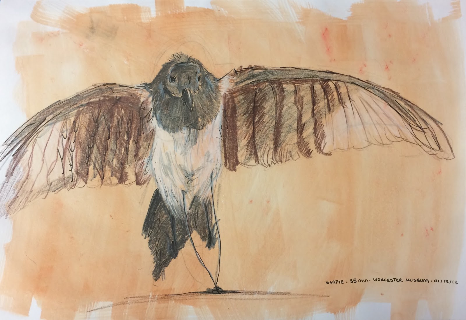
(7) is my favourite piece overall. I am so happy with how this turned out. I feel like the image goes well with the coloured background and shows good use of proportion, tone, and foreshortening. I think the reason this went so well is because I was sat really close to the model and I enjoyed drawing it. I'm glad I used fine liner to accentuate parts of it and add depth on top of the watercolour pencil.

(7)
Bird - 'Magpie'
Watercolour Pencil and Fine Liner
On Watercolour Wash Background
35 min.

02.12.16
Friday

As I explained earlier in the post, I left the museum too early as I misunderstood the task so I came back on Friday to finish!

For this first piece (8) I chose to do a pile of clothes rather than an individual piece and I'm glad I did. I think it makes for a more interesting composition. I like the way it turned out even if I didn't have time to do too much in the way of adding shade and tone.  

(8)
Clothing - 'Clothing Stand for People to Try'
Byro on White Paper Background
30 min.

Secondly, (9), I chose to do a squirrel instead of a larger animal for a mammal. I tried to add a lot of texture and I think it comes across well. I've represented it closely to how it appears. The only issue is I forgot to give it a shadow! This really lets the piece down as it is floating in the middle, although I'm still pleased with the piece.

(9)
Mammal - 'Grey Squirrel'
Watercolour Pencil and Fine Liner on White Paper Background
34 min

03.12.16
Saturday

Unfortunately, I didn't finish my work on Friday due to something personal coming up, so I popped back on Saturday to finish my last three pieces. 

Firstly, I drew a bottle. I used felt tip pens as an experiment and I don't like the outcome. The top of the bottle looks good and I feel like I captured the light, tone and texture, but the bottom half looks messy and childish. It was good to experiment but I probably won't use felt tips in this way again.

(10)
Weapon - 'Lee & Perrins sauce'
Byro and Felt Tip Pen.
30 min.

Secondly, (11) I drew a hat. I knew I wanted to draw this when I first saw it as It's so interesting. It's very reflective and has hair flowing from the top which was challenging to draw but really fun. This, along with the magpie, is one of my favourite pieces as I feel I've illustrated the reflection and textures well. I've learnt that if I pick an object I find intruiging, the drawing tends to go better.

(11)
Hat - 'Albert Pattern Helmet, 1850 - 70'
Pencil 2B-6B and Rubber.
30 min.

For my last piece, I chose this sword. It stood out to me because of its lion motif on the handle and so I focused mainly on that part of the sword. The only issue I have with this piece is the reflection of the metal on it is not well illustrated. I found it difficult to do as it was not just reflecting light, but mirroring images and people from around the room. Thus, I haven't quite done this artefact justice and in future would like to look into how to draw objects with mirror properties and practice that before attempting something similar.

(12)
Weapon - 'German Naval Sword, 1945'
Watercolour Pencil, Pencil 2B-6B and Rubber.
30 min.

Sunday, 27 November 2016

Sketches of the Day: 20th - 27th

This post is dedicated to my daily sketches.  I will continue to do multiple sketches and pick one a day to be posted at the end of the week as a series of seven. This week there are eight pieces because I started this project on a Sunday.

I've really enjoyed this process as the more I do it, the more I am inspired to draw. I find myself looking at the world around me and thinking "I've got to get out my sketchbook" rather than, "I've got to take a picture". The images below are instances over the last week where I have felt the urge to get out my sketchbook and document a moment in my life. 

20.11.16
My Pyjama Legs.
Byro, Pencil, Felt Tip Pens.

This image was created on a Sunday morning as I was sat on the floor in my bedroom organising my work for the day. I wanted to try drawing my legs from a perspective other than the mirror. I experimented with adding bits of colour using felt tip pens. I really like this drawing because I tried a new style and it worked out well.

21.11.16
Mouldy Lemon in the Kitchen.
6B Pencil.

Slightly self-explanatory, a housemate of mine left a lemon to go mouldy on top of the microwave in our house and I thought I'd draw the results. I wish I'd used a different medium, e.g. coloured pencil or watercolour, because you can't really see the mould and the colours were interesting.

22.11.16
Hair Curlers in Makeup Mirror.
Byro, Pencil and Felt Tip Pens.

Here I was doing my hair in the morning and decided to do a self-portrait while I was waiting for my curlers to curl my hair. I used my small makeup mirror as I haven't used it for a portrait yet and thought it would be interesting. I like the result but regret using the felt tips in the way I did and wish I hadn't done the outline of the mirror. 

23.11.16
Hannah Stabbing a Potato.
Byro Pen.

Here I did a speed drawing of my housemate while she was in the process of making a baked potato. I caught her in the moment she was preparing it for the oven and only spent about ten seconds maximum on the drawing. I like it because I think I captured the essence of her action.

24.11.16
Sweater on Radiator.
Thick Fine Liner.

This was a sweater someone had left to dry on the radiator in our house. I experimented with using a really thick fine-liner and I really like the result. The style is different to my usual and I will definitely be using this technique again. 

25.11.16
People on the Platform Opposite.
Byro Pen.

This was drawn on my way from Worcester Foregate station to Banbury station at my stop off point in Oxford. I sat on a bench on platform 4 drawing the people on the other side of the station. It was hard to do these drawings as trains came between us now and again so I had to be quick, but I really like this image. I drew people as individuals in the environment when they stood still after moving, so the scene is made up over time. 

26.11.16
Packing my Bag.
Pink Ball Point Pen.

This is a drawing of my backpack as I was packing it ready to head home to Worcester from my home in Northamptonshire. It was fun to experiment with a pink pen as it's a bit different. I feel like I captured some light and shadow but in future would spend longer on a sketch like this, especially as it is a still object so I would have time to draw it accurately. 

27.11.16
Morning Working.
Byro Pen.

This image is of my boyfriend working on his laptop in the morning in bed. I like the life shown in this image and am pleased that I included the environment as well as the subject as it adds context. It shows a bit of a story and along with my first image I drew this week, (My Pyjama Legs), is my favourite sketch of the week. 

Tuesday, 15 November 2016

Outside Work: Life Drawing Session - Arts & Culture Society

Today I went to a student-run life drawing session facilitated by the arts and culture society of which I am a member. It was at The Garage Studios and lasted two hours. I brought my A1 sketchpad and my art toolbox - I really enjoyed it.

Because of time constraints, I decided not to use wet mediums. I started with pencil and fine liner for the warm up exercises, (1), as they were only two minutes per drawing. It was a good way to get into drawing and to familiarise myself with the new models' body types.

We moved on to a second warm-up with (2) and I decided to stick with pencil again. In order to add some light and shadow, I used the technique of unfocusing my vision to see the simple tones and shaped of the models, this also got me ready for the longer tasks and made me focus.

Going into the longer exercises, (3), I wanted to use assorted graphite pencils in order to create a tonal drawing. I am quite happy with the models' body in my drawing, but I think I made her head too small. I found it difficult to draw her at the angle she was and in hindsight, I would have used my pencil more to check proportions before I committed to the piece.

Lastly, we did one more 25 min drawing, (4), this is my favourite piece. I decided to use oil pastels to create tone in the way we had been taught in week six and seven. I chose dark green, light green and yellow pastels for the dark, mid and light tones, and left parts white to show the brightest parts. I feel like the proportions were done well here and I have shown the light accurately. 

Overall it was a great chance to practice the techniques I had learnt in my weekly seminars. It was a challenge to use different models especially in composition with each other, but I found myself naturally using the methods we used in-session to create good pieces of work.

It was also nice to be in a room with different artists and illustrators and see the types of techniques they used. I saw one girl using just white chalk, and a boy using cubes and straight lines to create an impression of the model rather than sketchy drawings - it was an inspiring atmosphere.

(1)
Assorted Pencils 2B - 6B/ Fine liner.
2 min per drawing.

(2)
Assorted Pencils 2B - 6B.
5 min per drawing.
(3)
Assorted Pencils 2B - 6B.
25 min. 
(4)
Oil Pastels.
25 min.

Week 7 Life Drawing Session 6: Working in Layers

For this life drawing lesson I wanted to push myself outside of my comfort zone and so I decided to use acrylic paint. In the previous lesson, I'd used watercolour paint which I'm very used to. The pieces I created surpassed my expectations and I feel like I've improved so much over the module. Obviously, there is always improvement to be made, but I feel I've come a long way from the beginning of the semester. 

The first two exercises, (1) and (2), were warm up exercises. I found that they were a good way to get into the session and forced me not to worry and just to draw. I was particularly pleased with the central figure in (1) as I feel I captured the model's position well and used correct proportions. The second exercise was great in the way that it got me into the habit of looking for light and shadow before we did our larger pieces. 

For (3) I used a medium sized round brush and two contrasting colours in acrylic: purple and yellow, as well as white for highlighting. I actually misunderstood the exercise at first. I was under the impression we were doing three drawings in thirty minutes, and so I rushed mine a bit - only to find we were doing one drawing in thirty minutes, using ten-minute intervals to split dark, medium and light tones. Because I was rushing, the painting isn't as good as it could be and the proportions are a little off, but in future, I know to ask if I am unsure!

I was really pleased with (4). I used a medium-sized flat brush as I wanted to get the impressions rather than the detail and I felt this would help. Again I used the contrasting colours in acrylic: purple and yellow, with white to highlight. This was more successful than (3) not only because I took my time and understood the exercise, but because I created an environment for the subject to be in. This was upon feedback from the tutor to the class to include it. I feel like the proportions, tone and 3D effect of the image are done well in this piece and i I'm quite proud of it.

I believe (5) is the best piece of life drawing I have done so far. I used a large flat brush and multiple acrylic paint colours: pink, blue, yellow, green, etc. I chose these colours as they contrast and compliment each other.I'm so pleased that all of the things we have learnt throughout the semester come through; tone, perspective, foreshortening etc.   

For my last piece (6), I used the large flat brush again, but this time I only used shades of blue. It creates a cold and lonely effect and makes the model look sad. I'm not a fan of this piece simply because I think I have done better in previous pieces in the session, and I made mistakes with the face which is where one's eyes are often drawn to. 

I feel like building on week 6 and learning about tone again led to a bit of a breakthrough moment for me in the sense that now I feel I can use acrylics, and I can use the techniques we have learnt so far. I have enjoyed the process of developing my work and style over the weeks immensely.


(1)
1 min per drawing. 2B Pencil.
(2)
5 min. Charcoal.  
(3)
30 min. Acrylic Paint.
(4)
30 min. Acrylic Paint. 
(5)
30 min. Acrylic Paint. 
(6) 
30 min. Acrylic Paint.